Google Analytics
UX Sitelens
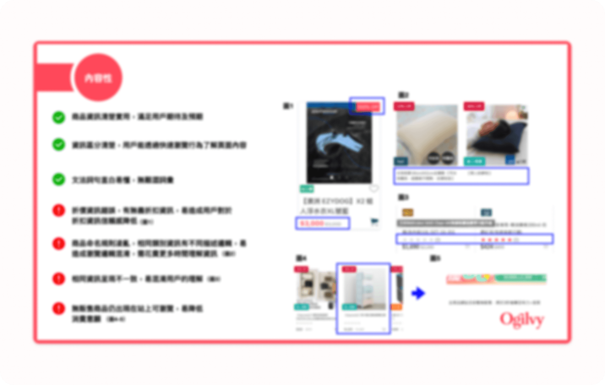
Clear view of shopping list information
Simple checkout process
Convenient form filling
Smooth checkout flow
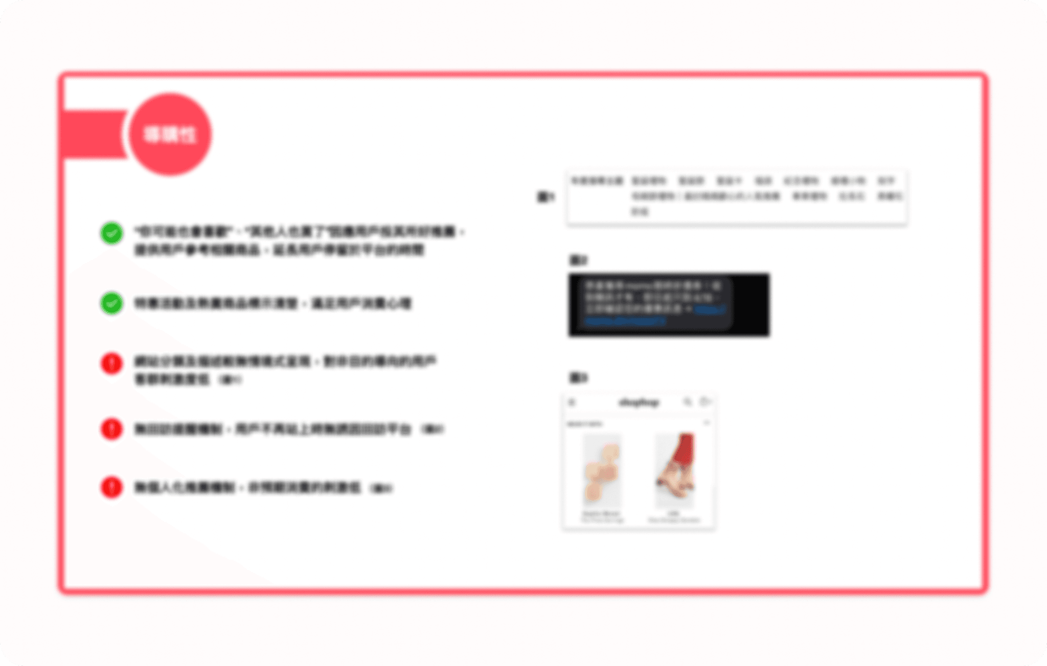
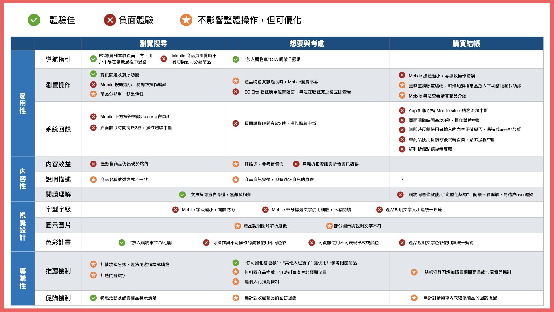
・Less scenario-based consumer guidance
・Single and inflexible product categorization
・Limited options for switching between products within the same category
・Primarily goal-oriented shopping guidance, unable to stimulate non-target shopping groups.
Enhancing browsing options and pathways for product categorization to ensure smooth and unhindered user navigation.
A:Add related categories and tags
Add related category links on the product page to facilitate users browsing similar product categories.
Increase multi-dimensional tag classification to provide users with more flexible and diverse product categorization, connecting a wider range of products through tags.
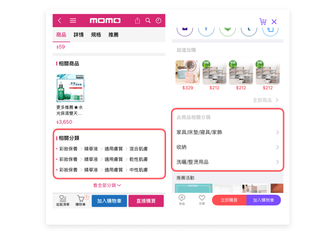
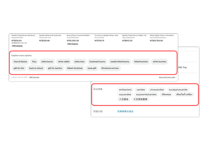
Ref example
B:Guided consumption, personalized recommendations
Multi-faceted product recommendations attract users to view and browse, stimulating non-purpose-oriented shopping choices, such as: related recommendations, popular recommendations, thematic recommendations, personalized recommendations.
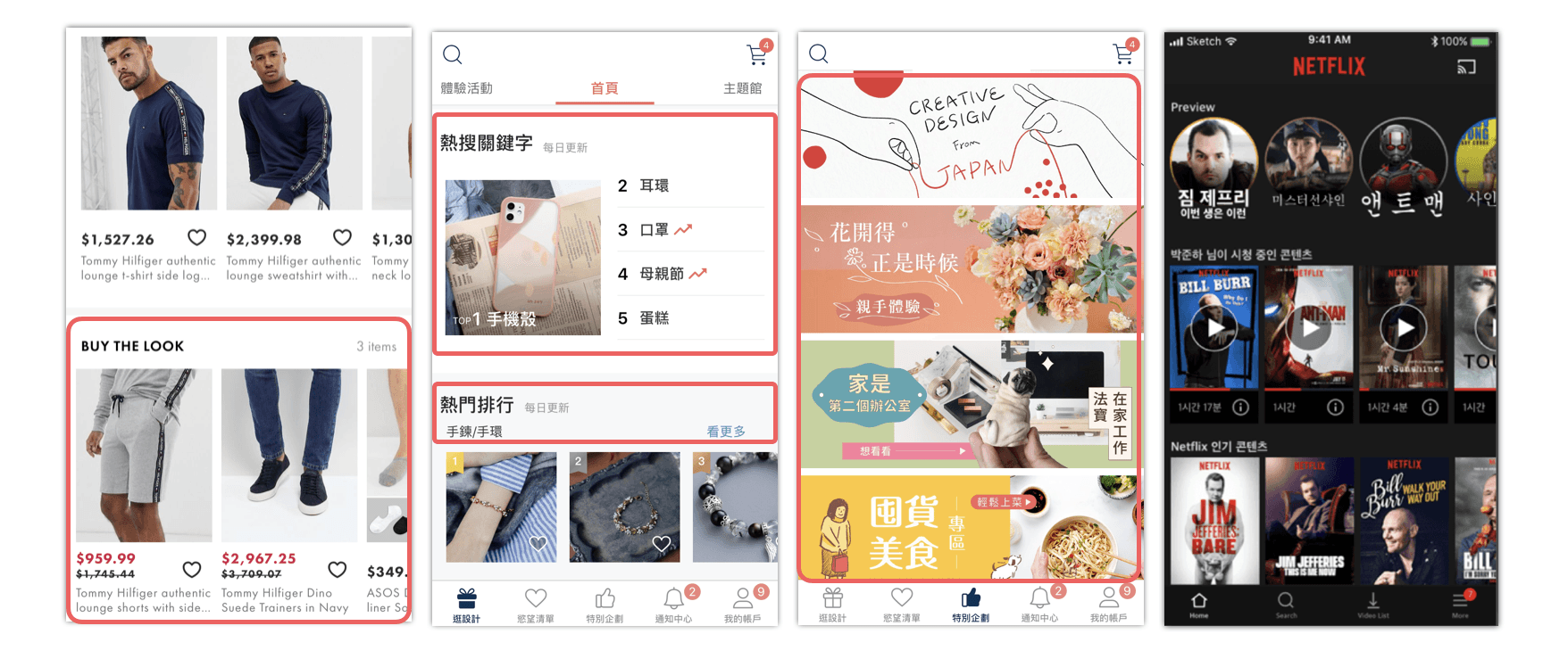
Ref example
・Few reviews, low reference value
・Some product information is verbose, making it difficult to focus during browsing
・Incorrect review information reduces user trust in the information
Accelerate user purchase decisions through user reviews and expert knowledge-based information.
A:Convenient reviews &incentive rewards
Remind users to leave reviews at appropriate times, offering convenient and template text to enhance users' willingness to provide feedback. Provide review incentives, such as coupons, loyalty tokens, etc.
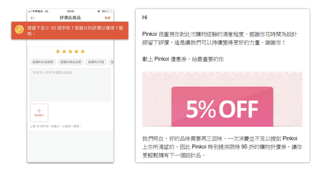
Ref example
B:Professional reviews & Key information comparison
Provide expert reviews to offer users informative content. Incorporate key information comparison to allow users to quickly grasp the essential aspects of the product.
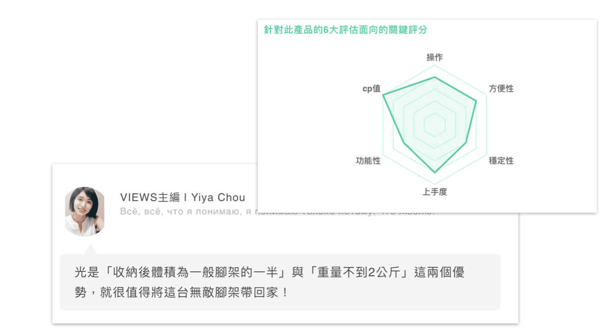
Ref example
The proportion of items purchased and items favorited aligns closely, suggesting that the favorite function is frequently used by users to temporarily store items they intend to purchase before completing the checkout.
Convenient and prominent favorite list button, shorten the steps from adding to favorites to checkout.
Elevate the favorite list entry to the top level of the navigation bar.
The current desktop version requires two steps to access the favorite list, while the mobile version requires three steps.
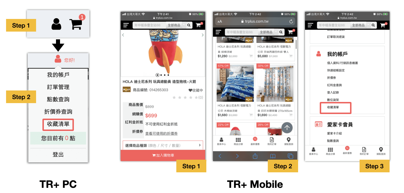
Elevate the favorite list entry to the top level of the navigation bar, allowing users to access the favorite list with one click on every page, thereby reducing the operational steps.
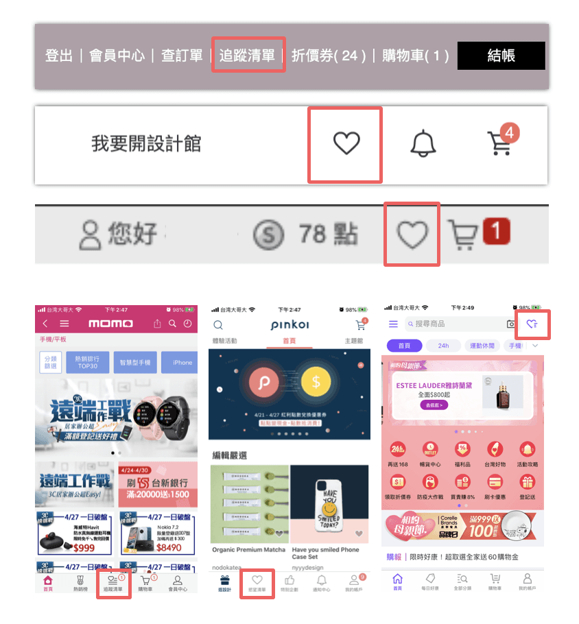
Ref example
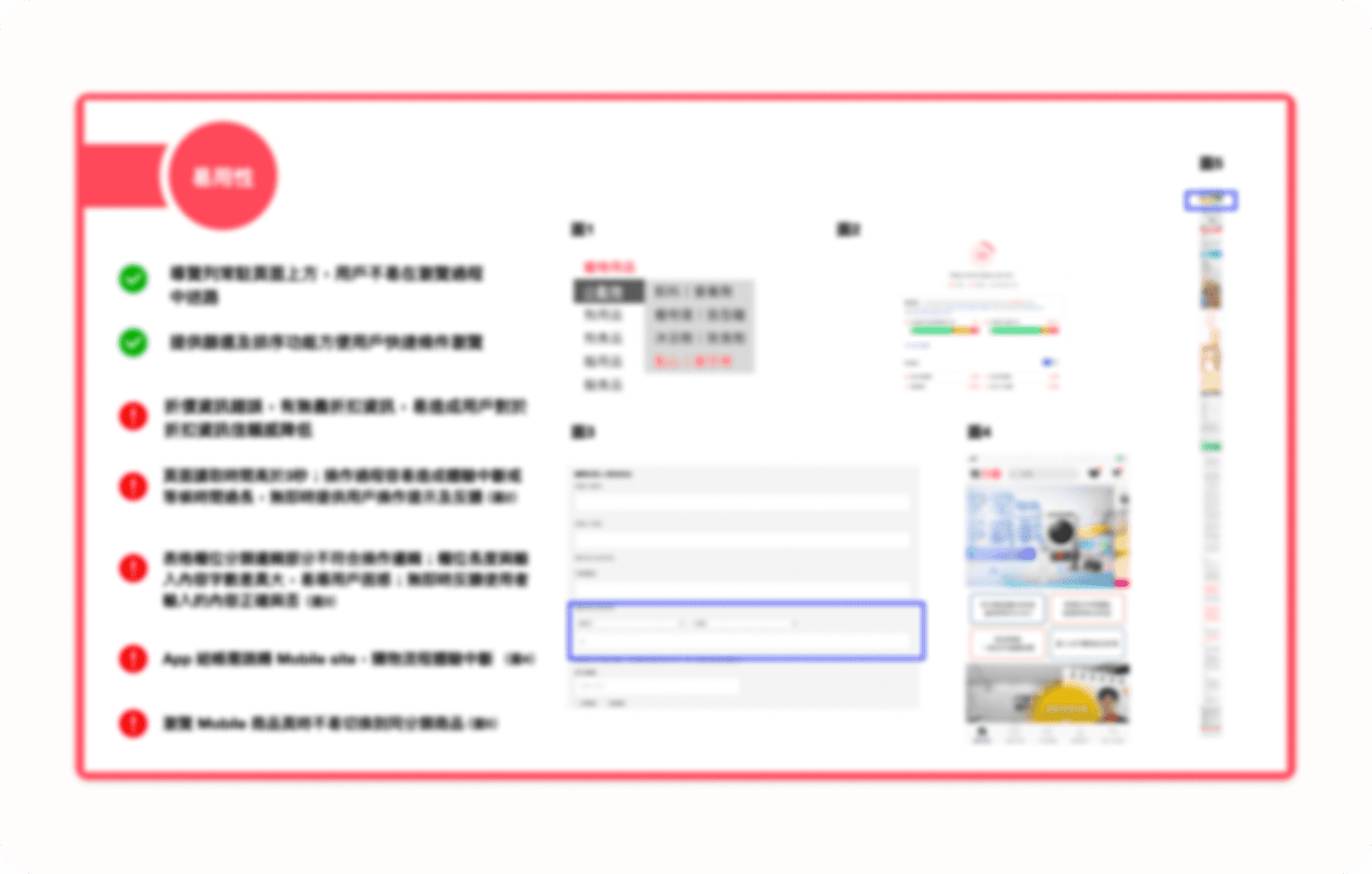
・The form lacks immediate feedback for errors, which can increase checkout time and lead to user abandonment.
・The information layout is disorganized, making it difficult to read.
・The font size and buttons on mobile are too small, making them hard to read and prone to user errors.
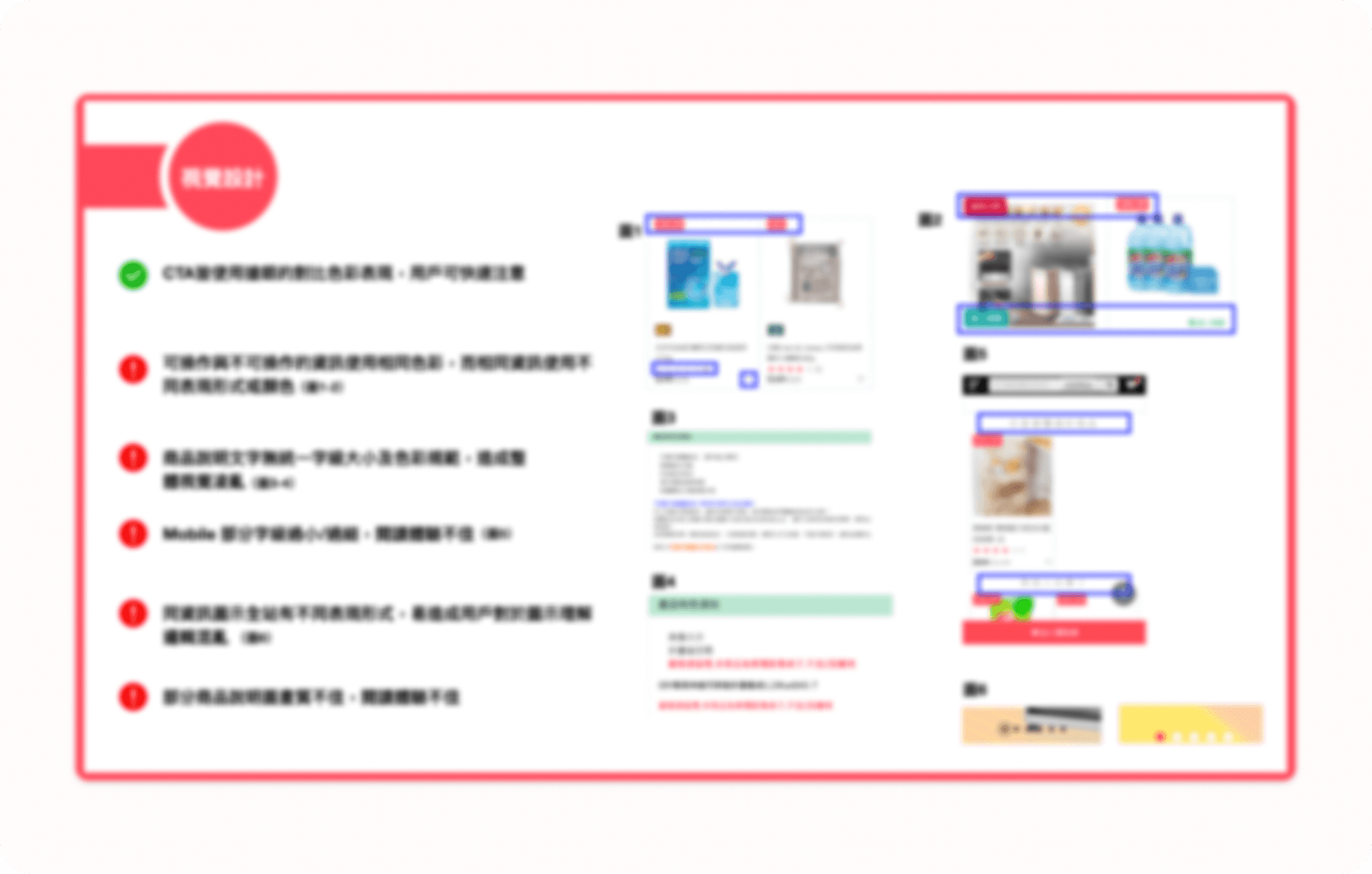
// Due to proprietary information, the images are blurred. //
Optimize the mobile user experience interface to improve checkout conversion on mobile devices.
A:Adapt font sizes and button sizes for mobile devices.
Optimize for increased information and functionality, enhancing browsing comfort, reducing errors, and increasing the likelihood of users completing purchases during fragmented time periods.
B:Optimize the order of payment methods.
Optimize the order of payment options based on modern user payment habits and reference data to streamline the checkout process.
Provide instant system feedback reminders to reduce user impatience or abandonment due to waiting times.
A:Offer real-time error feedback.
Provide users with instant error messages while filling out forms to prevent users from filling out the entire form before being notified of errors, thus reducing user frustration.
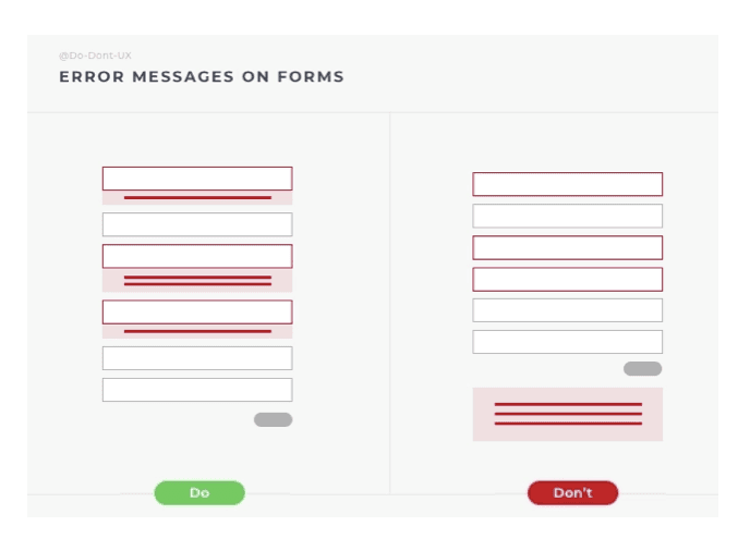
Ref example
B:Offer engaging loading animations.
Provide users with entertaining loading animations during system operations to reduce perceived wait times.
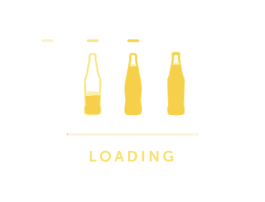
Ref example
・Small/fine font size makes it difficult to read.
・Inconsistency in the presentation of information/operations across pages.
・Same color used for both actionable and non-actionable buttons.
Ensure consistency in user experience, readability of information, and enhance the overall presentation of the brand style.
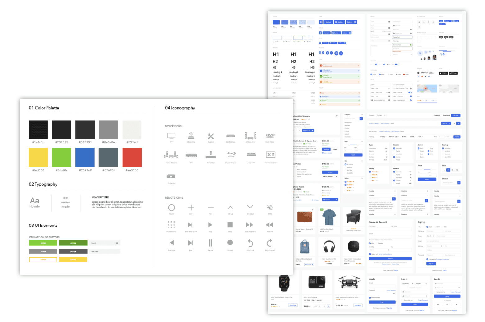
Ref example
Enhanced usability: Consistent design and standardized interaction patterns make it easier for users to navigate and interact with the website or application.
Improved readability: Clear and standardized design elements ensure that information is easily accessible and readable for users, enhancing their overall experience.
Streamlined experience: Standardized workflows and design elements across the platform create a seamless experience for users, reducing confusion and frustration.
Increased trust and confidence: A cohesive and professional design instills trust in users, making them more confident in their interactions with the brand and its products or services.
Improved brand image: Consistent and standardized design styles and workflow can enhance the consistency and professionalism of the brand image.
Increased user satisfaction: Providing consistent and readable design and operation methods can enhance users' overall experience, thereby increasing their satisfaction.
Increased brand loyalty: Good user experience can increase users' trust and loyalty to the brand, thereby increasing brand loyalty and reputation.
Cost savings: Establishing a comprehensive design system can improve team efficiency, reduce redundant work, and thus save time and costs.
