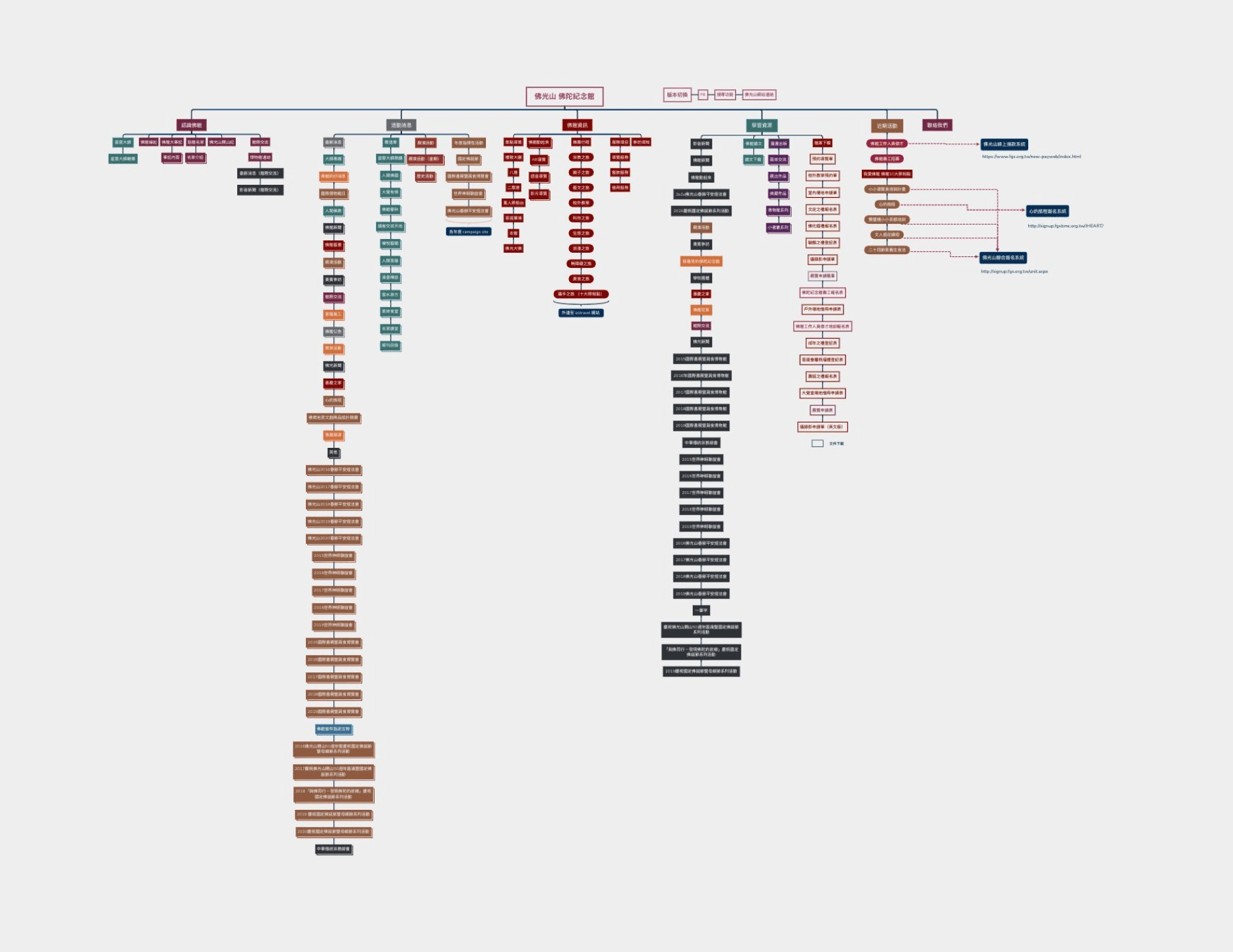
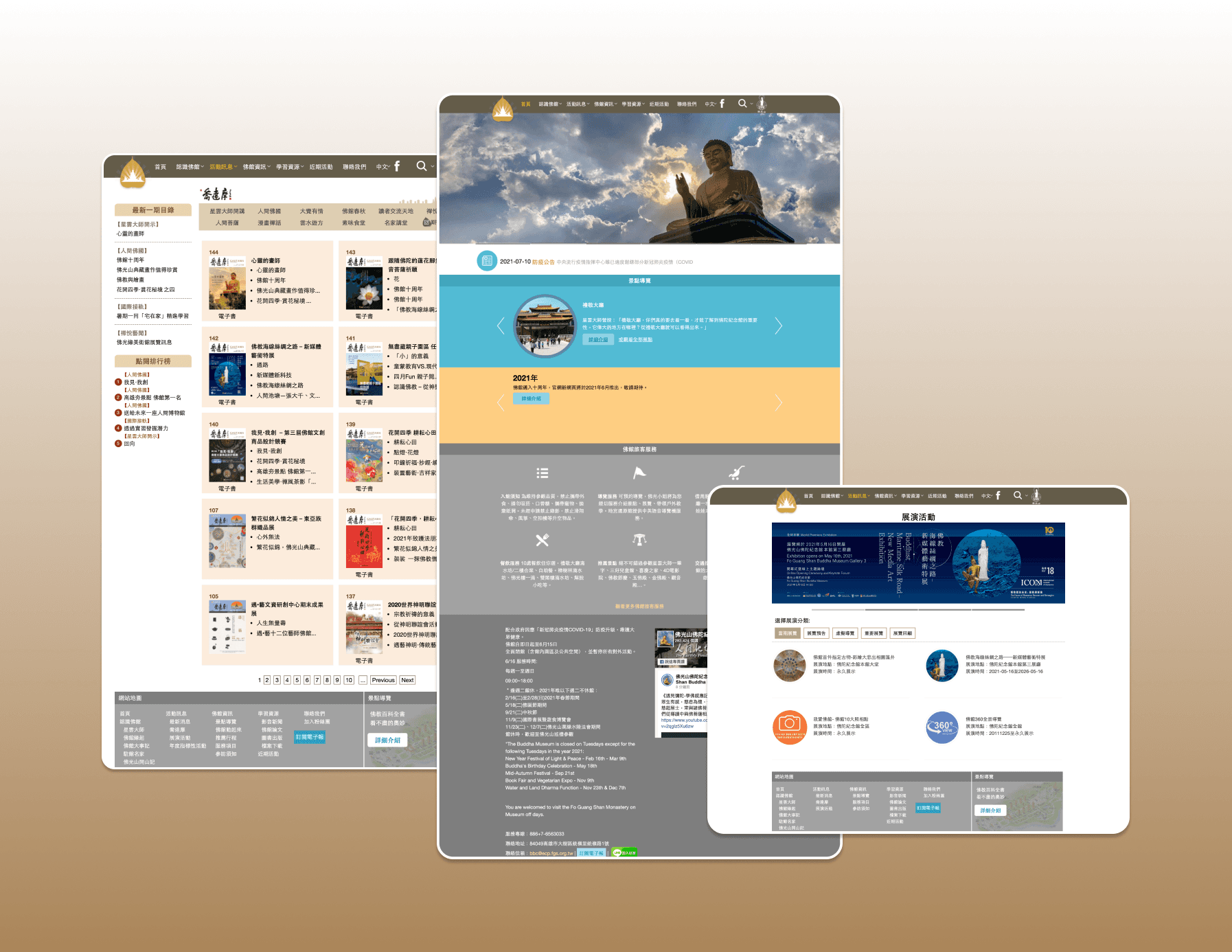
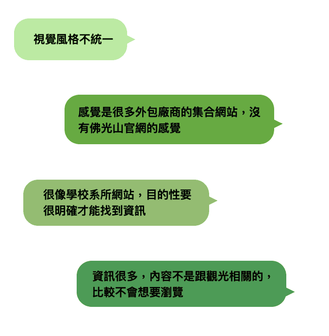
The website suffers from content fragmentation, where information is dispersed across multiple sections without a clear organizational structure. This lack of cohesive guidance forces users to engage in meticulous searching to access relevant information.
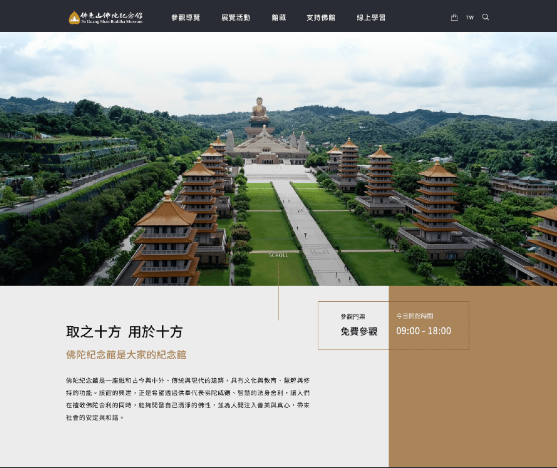
The website's visual design and color palette do not effectively convey the reverence of religious traditions nor the artistic aura associated with religious artifacts. Predominantly text-based interface planning gives the impression of an informative resource rather than capturing the essence of a sacred institution.
RESEARCH
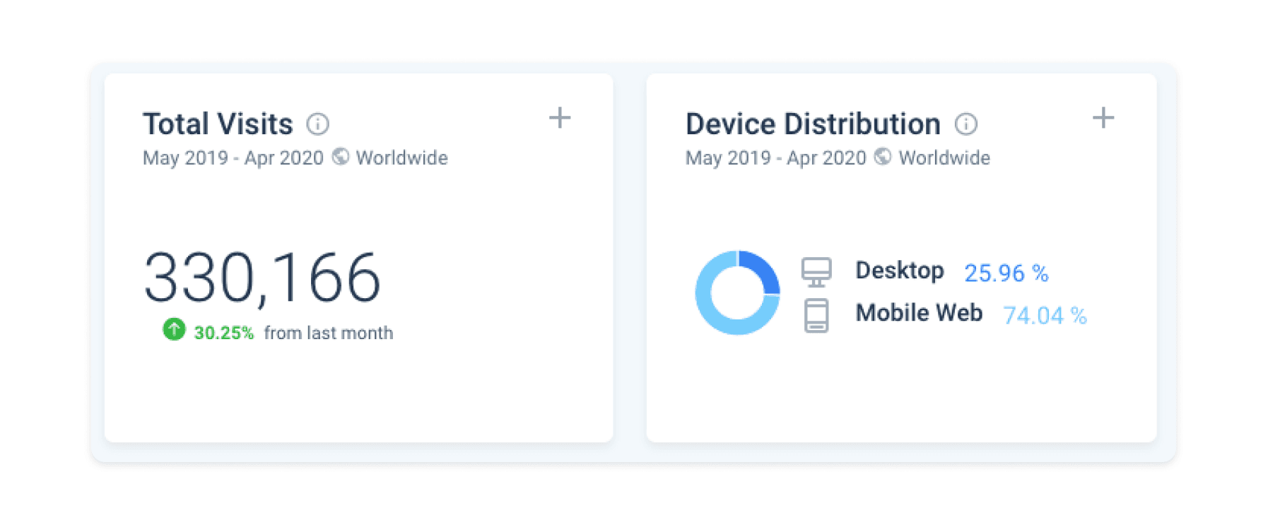
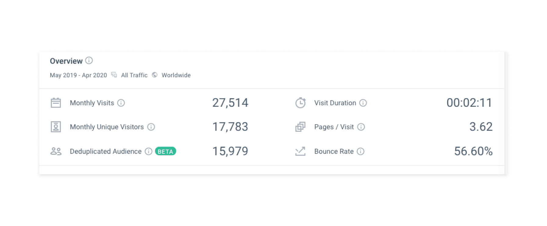
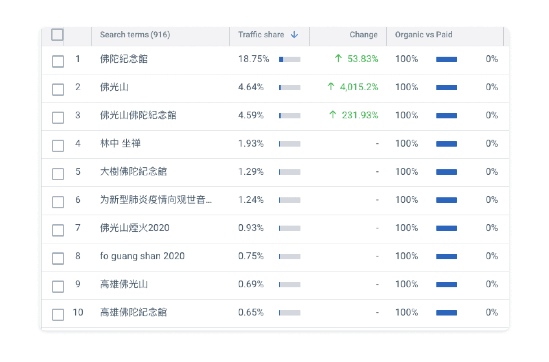
INTERVIEW
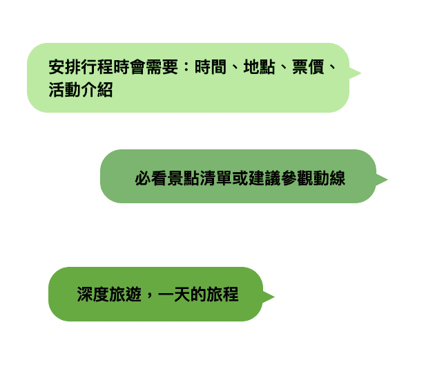
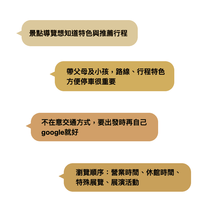
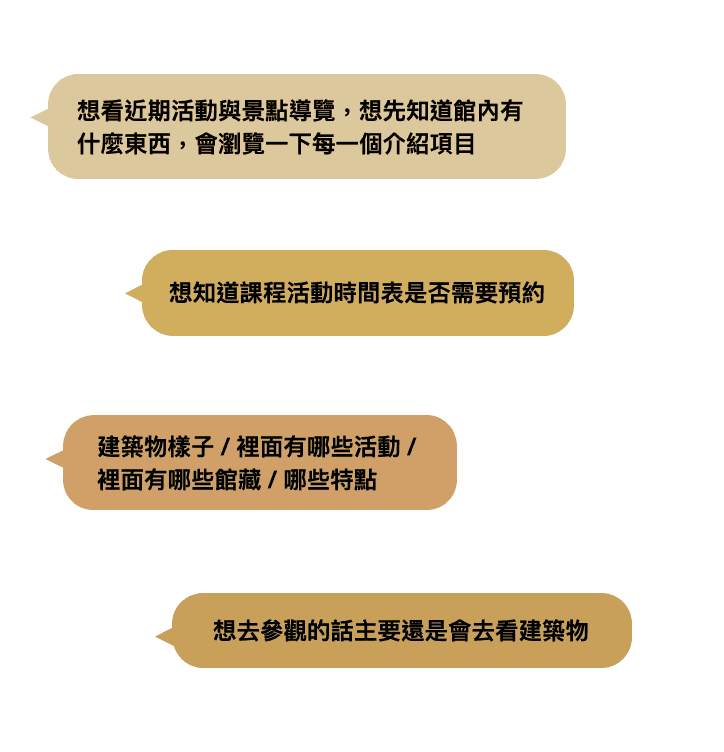
In an effort to provide a family-friendly experience with minimal planning, there's a focus on highlighting attractions and recommended itineraries. This includes seeking a comprehensive list of recommended attractions to ensure no unique site is missed and to facilitate detailed trip planning. Additionally, browsing and gathering information online remains essential for trip planning and exploration. However, it's noted that the website requires updating of information and an overall redesign to enhance its visual appeal and functionality.
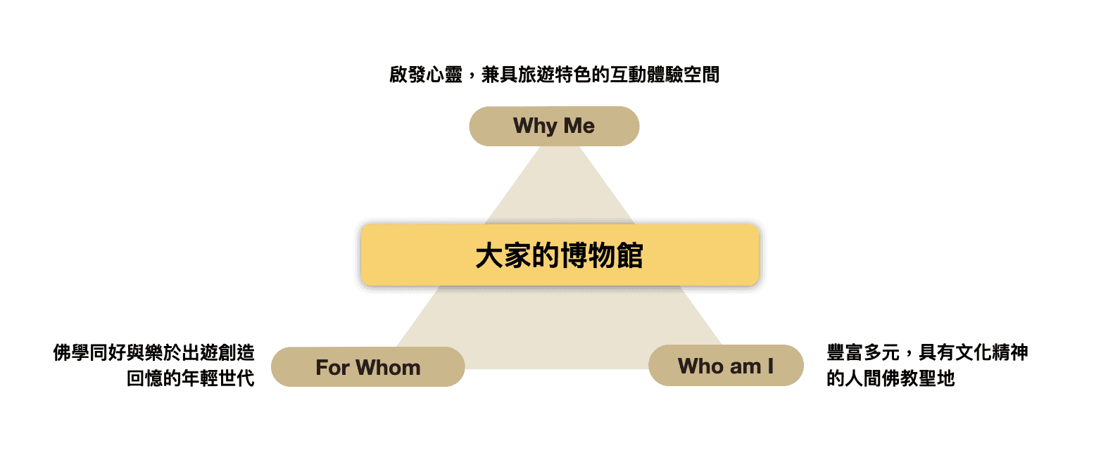
Visual style
Mobile fit
Search
Experience
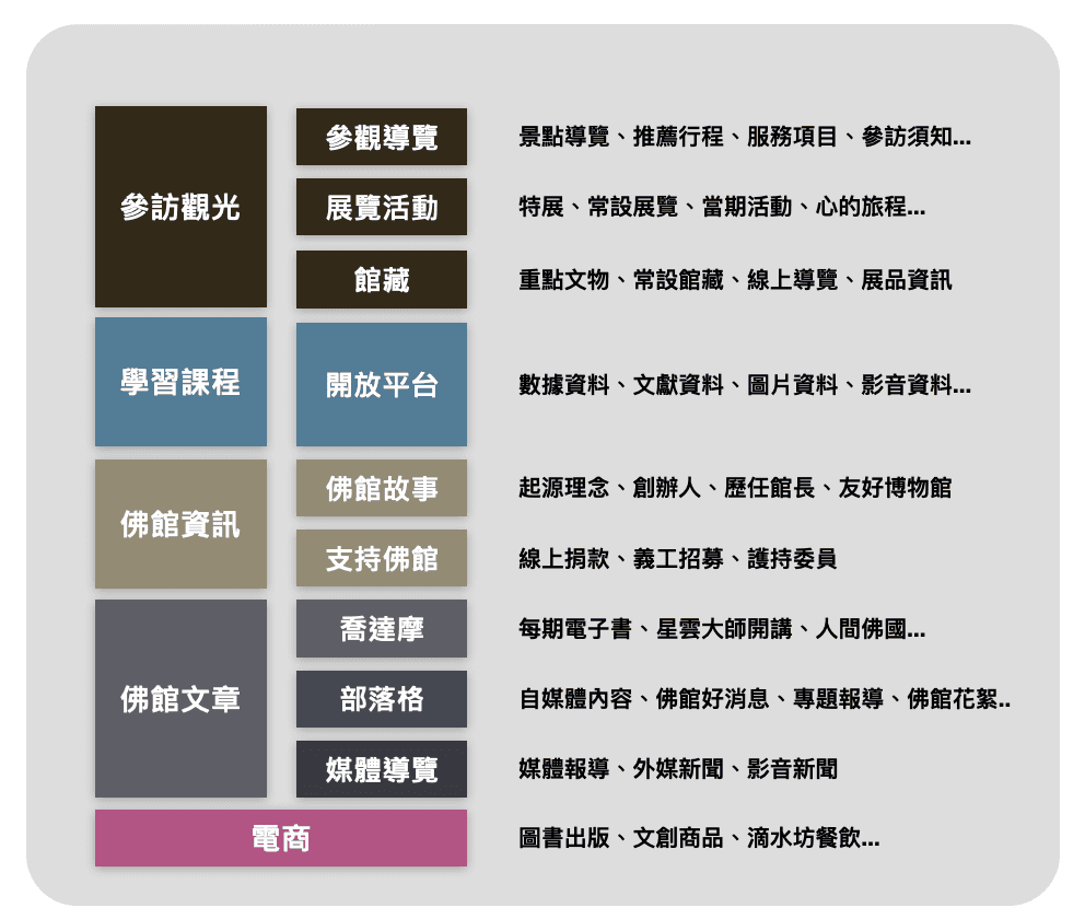
Content Consolidation and Categorization for Enhanced User Experience
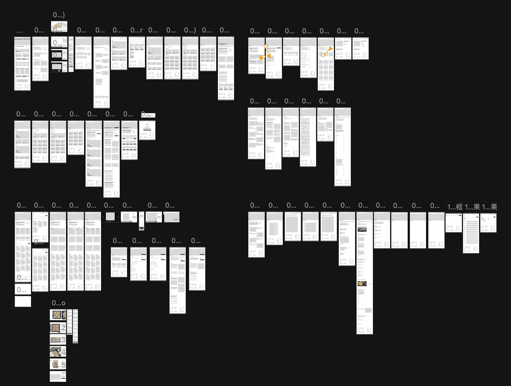
By reviewing existing content and anticipated updates, we've compiled and summarized information into four user-centric categories. Utilizing forms and examples, our objective is to aid staff in reorganizing website content, removing outdated or redundant information, while integrating necessary updates.
Prioritize Vital User Information and Optimize Website Structure
Identify critical user information and tailor its placement based on usage patterns and needs. Enhance the website's information architecture to optimize user experience, streamline process flows, introduce necessary functionalities, all while retaining essential site content.
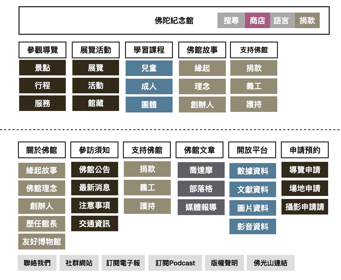
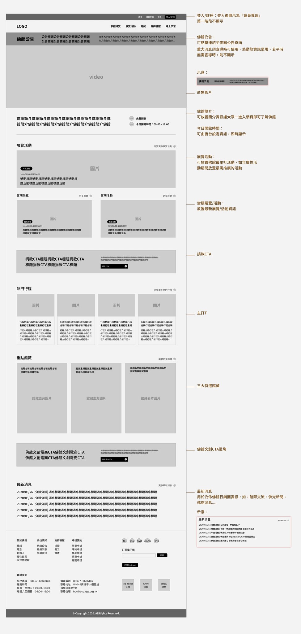
Design A


